


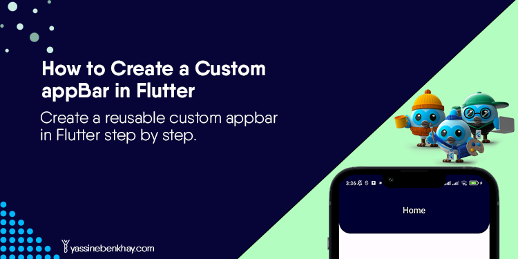
Table of Contents
Even if you change the AppBar color from its default in Flutter, sometimes it won’t reflect the application idea, maybe you’re building a travel app, and you want the AppBar to reflect the adventurous spirit of your users or any other custom app. Having a custom reusable AppBar can cut the traditionality of the default AppBar in Flutter, In this tutorial we will learn how to create a custom AppBar step by step. so Let’s begin.
01
of 04
Create a custom AppBar Class
First things first, let’s create a CustomAppBar class that extends StatelessWidget and implementsthe PreferredSizeWidget which is an abstract class that is used to create widgets that can define their preferred size.
The PreferredSizeWidget has a single abstract method called preferredSizethat should be overridden by its subclasses, This method returns a Size that represents the preferred size of the widget.
In this example, we override the preferredSize method to give the height to the toolbarHeight‘s appbar widget.
Size get preferredSize => Size.fromHeight(height);
The properties that our custom appbar will have are the following:
  final String title;
  final Color backgroundColor;
  final Color textColor;
  final double height;
  final double bottomLeftRadius;
  final double bottomRightRadius;
These properties will be required in the CustomAppBar class constructor.
const CustomAppBar({
super.key,
required this.title,
required this.backgroundColor,
required this.textColor,
required this.height,
required this.bottomLeftRadius,
required this.bottomRightRadius,
});
In the build method, we return an AppBar with toolbarHeight to give a custom height to the AppBar, the BorderRadius only in the
bottomRight, and bottomLeft, to give rounded edges, title, backgroundColor, and textColor which will be the color of the appbar title.
Full Class:
import 'package:flutter/material.dart';
class CustomAppBar extends StatelessWidget implements PreferredSizeWidget {
  final String title;
  final Color backgroundColor;
  final Color textColor;
  final double height;
  final double bottomLeftRadius;
  final double bottomRightRadius;

   const CustomAppBar({super.key, required this.title, required this.backgroundColor,required this.textColor, required this.height,required this.bottomLeftRadius,required this.bottomRightRadius,});
  @override
  Size get preferredSize => Size.fromHeight(height);
  @override
  Widget build(BuildContext context) {
    return AppBar(
        shape:  RoundedRectangleBorder(
        borderRadius: BorderRadius.only(
        bottomLeft: Radius.circular(bottomLeftRadius),
        bottomRight: Radius.circular(bottomRightRadius),
    )),
      centerTitle: true,
      title: Text(title,style: TextStyle(color: textColor),),
      backgroundColor: backgroundColor,
      toolbarHeight: height,

    );
  }
}
02
of 04
Use The Custom AppBar
Now you can use the CustomAppBar on any screen giving the desired values to its properties like so:
 Scaffold(
        appBar: const CustomAppBar(
          title: 'Home',
          backgroundColor: Color(0xff000132),
          textColor: Colors.white,
          height: 120.0,
          bottomLeftRadius: 30,
          bottomRightRadius: 30,
        ),

      ),
Full Class:
import 'package:flutter/material.dart';
import 'package:custom_appbar_tutorial/custom_appbar.dart';

void main() {
  runApp(const MyApp());
}

class MyApp extends StatelessWidget {
  const MyApp({super.key});

  @override
  Widget build(BuildContext context) {
    return MaterialApp(
      debugShowCheckedModeBanner: false,
      title: 'Flutter Demo',
      theme: ThemeData(
        useMaterial3: true,
      ),
      home:    Scaffold(
        appBar: const CustomAppBar(
          title: 'Home',
          backgroundColor: Color(0xff000132),
          textColor: Colors.white,
          height: 120.0,
          bottomLeftRadius: 30,
          bottomRightRadius: 30,
        ),

      ),
    );
  }
}
03
of 04
Result
Here’s what the result looks like:

04
of 04
Conclusion
In this tutorial, we’ve learned how to create a custom AppBar in Flutter. To explore different ways of changing its color and appearance, refer to this tutorial for more insights.


Good job 👌
Thank you.