Table of Contents
The user interface is a crucial part of any mobile application development, not only a beautiful design can shape the visual look, but can also improve the engagement, satisfaction and the success of the app.
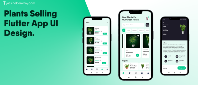
In this post I’ll present a plants selling Flutter UI app design, with 3 screens, home, store and details. At the end you’ll find the github repo link if you want to learn more on how this app design is created, so without further ado let’s jump right in.
01
of 04
Home
In the Home screen we have a headline with the user image, under that, we have the search bar with a filter button, then we have the a categories ListView.separated . For the plants card it’s also in a ListView.separated as well as the popular items.

02
of 04
Plant Details
For the plant details we have the first part of the screen is for the plant image and some details, and for the second part we have more info about the plant such as the about plant details and some dimensions.
at the bottom of the screen we have a bottomShet with the price and a call to action checkout.

03
of 04
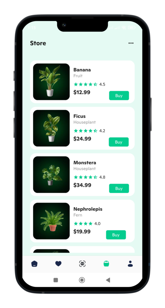
Store
In the store screen we have a ListView.separated as well with different card plants with a buy button.
04
of 04
Get Source Code
If you are interested in learning more and using this design in your own projects, feel free to check this github repo.


