Table of Contents
Learning How to analyze UI and turn it to code is an essential part of any mobile application development process.
In this post, I have a 3 pages Flutter UI design to Learn from, Below I explain each page with the important widgets used to build it, So let’s dive in.
01
of 03
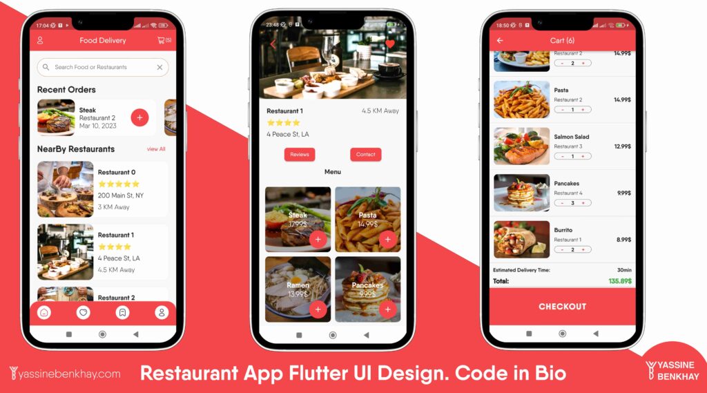
Home Page
The home page has the textField, a horizontal ListView.builder , then the other ListView to show restaurants.

02
of 03
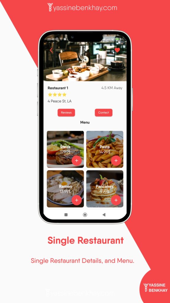
Single Restaurant
The single restaurant screen has a Hero with the Image as its child, the restaurant details in a Row , the contact and review in another Row and the GridView that displays the menu.
03
of 03
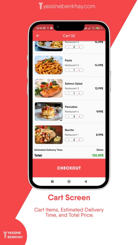
Cart/Checkout
The cart screen has a ListView Separated by a Diver, and the ListView Item is a Row holding the images and Column Details( name, restaurant, and button) also the price, these two pieces are inside another Row so we can have a space between them.
To learn more check the source code on my GitHub.





Comments 3