


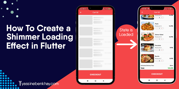
Table of Contents
In mobile application development, loading times are inevitable. From a user experience(UX) perspective, showing users that the loading is taking place is critical; the famous approach we find primarily used in different apps is a grey color with a shimmer animation over the shapes that approximate the type of content that is loading.
In a previous blog post, we designed a Restaurant Flutter App UI Design; in this one, we will take the cart screen in that design and apply the shimmer effect to it to give a better user experience while the cart items are loading.
You can find the source here to follow up with the tutorial.
So with the intro out of the way, let’s write some Flutter code!
Read Also:
The Ultimate Collection of vs code Extensions for Flutter
Flutter Roadmap | How To Learn Flutter In 2022 The Right Way
Best Books to Learn Flutter in 2023
Top 8 Multi-Restaurant Flutter App Templates
01
of 05
Analyze the actual content
The first thing to do is analyze the widgets you want to represent as shapes; as shown below, we have a listview with cart items.
Each item is a Row with two elements, a text and another row ( the red one) with the image and a column with the text and button.
The goal is to create shapes representing the eventual content as accurately as possible.

As we discussed, the code for the display of the order cart item follows:
_buildCartItem(Order order) {
   return Container(
     height: 100.0,
     margin: const EdgeInsets.all(12),
     child: Row(mainAxisAlignment: MainAxisAlignment.spaceBetween, children: [
       Expanded(
         child: Row(
           children: [
             Container(
               width: 150,
               decoration: BoxDecoration(
                   borderRadius: BorderRadius.circular(10),
                   image: DecorationImage(
                       fit: BoxFit.cover,
                       image: AssetImage(order.food!.imageUrl!))),
             ),
             Expanded(
               child: Container(
                 margin: const EdgeInsets.all(12.0),
                 child: Column(
                   mainAxisAlignment: MainAxisAlignment.center,
                   crossAxisAlignment: CrossAxisAlignment.start,
                   children: [
                     Text(
                       order.food!.name!,
                       style: const TextStyle(
                           fontWeight: FontWeight.w600, fontSize: 16),
                     ),
                     const SizedBox(
                       height: 8,
                     ),
                     Text(
                       order.restaurant!.name!,
                       style: const TextStyle(
                           fontWeight: FontWeight.w400, fontSize: 14),
                     ),
                     const SizedBox(
                       height: 8,
                     ),
                     Container(
                       width: 100.0,
                       decoration: BoxDecoration(
                           borderRadius: BorderRadius.circular(10.0),
                           border:
                               Border.all(width: 0.8, color: Colors.black54)),
                       child: Row(
                         mainAxisAlignment: MainAxisAlignment.center,
                         children: [
                           GestureDetector(
                             onTap: () {},
                             child: const Text(
                               "-",
                               style: TextStyle(
                                   fontWeight: FontWeight.w600,
                                   color: AppColors.primaryColor),
                             ),
                           ),
                           const SizedBox(
                             width: 20,
                           ),
                           Text(
                             order.quantity.toString(),
                             style: const TextStyle(
                               fontWeight: FontWeight.w600,
                             ),
                           ),
                           const SizedBox(
                             width: 20,
                           ),
                           GestureDetector(
                             onTap: () {},
                             child: const Text(
                               "+",
                               style: TextStyle(
                                   fontWeight: FontWeight.w600,
                                   color: AppColors.primaryColor),
                             ),
                           ),
                         ],
                       ),
                     )
                   ],
                 ),
               ),
             )
           ],
         ),
       ),
       Text(
         "${order.food!.price!.toString()}\$",
         style: const TextStyle(fontWeight: FontWeight.w600, fontSize: 16),
       ),
     ]),
   );
 }
02
of 05
Install the Shimmer Package and Create the Shimmer Effect for The Cart Item
We will use the shimmer package from pub.dev. You can find it here.
In the first step, we will create the shimmer effect for the cart item.
class CartItemShimmer extends StatelessWidget {
  const CartItemShimmer({super.key});

  @override
  Widget build(BuildContext context) {
    return Container(
      height: 100.0,
      margin: const EdgeInsets.all(12),

    );
  }
}
Notice we have created a container with the same height and margin as the actual container in the design that holds the Rows.
Now we will add the child of this container, the Shimmer widget, with the base color and the highlightColor.
class CartItemShimmer extends StatelessWidget {
  const CartItemShimmer({super.key});

  @override
  Widget build(BuildContext context) {
    return Container(
      height: 100.0,
      margin: const EdgeInsets.all(12),
      child: Shimmer.fromColors(
        baseColor: Colors.grey[300]!,
        highlightColor: Colors.grey[100]!,

    ),
 );
  }
}
The last thing we create is the child of the Shimmer, which will be the representation of the actual content.
class CartScreenShimmer extends StatelessWidget {
  const CartScreenShimmer({super.key});

  @override
  Widget build(BuildContext context) {
    return Container(
      height: 100.0,
      margin: const EdgeInsets.all(12),
      child: Shimmer.fromColors(
        baseColor: Colors.grey[300]!,
        highlightColor: Colors.grey[100]!,
        child: Row(
          mainAxisAlignment: MainAxisAlignment.spaceBetween,
          children: [
            Expanded(
              child: Row(
                children: [
                  Container(
                    width: 150,
                    decoration: BoxDecoration(
                      borderRadius: BorderRadius.circular(10),
                      color: Colors
                          .white,
                    ),
                  ),
                  Expanded(
                    child: Container(
                      margin: const EdgeInsets.all(12.0),
                      child: Column(
                        mainAxisAlignment: MainAxisAlignment.center,
                        crossAxisAlignment: CrossAxisAlignment.start,
                        children: [
                          Container(
                            width: double.infinity,
                            height: 16,
                            color: Colors.white,
                          ),
                          const SizedBox(height: 8),
                          Container(
                            width: 80,
                            height: 14,
                            color: Colors.white,
                          ),
                          const SizedBox(height: 8),
                          Container(
                            width: 100.0,
                            height: 30.0,
                            decoration: BoxDecoration(
                              borderRadius: BorderRadius.circular(10.0),
                              border:
                                  Border.all(width: 0.8, color: Colors.black54),
                              color: Colors.white,
                            ),
                          ),
                        ],
                      ),
                    ),
                  ),
                ],
              ),
            ),
            Container(
              width: 80,
              height: 16,
              color: Colors.white,
            ),
          ],
        ),
      ),
    );
  }
}
The Shimmer Loading Effect for the cart Item is done and ready to be used; we still have the delivery time estimation and total price part.
03
of 05
Create The Shimmer Effect for The Delivery Estimation Time and Total Price
If we analyze the widget responsible for displaying the delivery time estimation and the total price, we find it is a Container with a Column that has two Row, one for the estimation of the delivery and the other for the total price.
Container(
                    margin: const EdgeInsets.all(10),
                    child: Column(
                      children: [
                        const Row(
                          mainAxisAlignment: MainAxisAlignment.spaceBetween,
                          children: [
                            Text(
                              "Estimated Delivery Time:",
                              style: TextStyle(
                                fontWeight: FontWeight.w600,
                              ),
                            ),
                            Text(
                              "30min",
                              style: TextStyle(
                                fontWeight: FontWeight.w600,
                              ),
                            )
                          ],
                        ),
                        const SizedBox(
                          height: 10,
                        ),
                        Row(
                          mainAxisAlignment: MainAxisAlignment.spaceBetween,
                          children: [
                            const Text(
                              "Total:",
                              style: TextStyle(
                                fontSize: 18,
                                fontWeight: FontWeight.w900,
                              ),
                            ),
                            Text(
                              "${totalPrice.toStringAsFixed(2)}\$",
                              style: const TextStyle(
                                fontWeight: FontWeight.w900,
                                color: Colors.green,
                                fontSize: 18,
                              ),
                            )
                          ],
                        ),
                        SizedBox(
                          height: MediaQuery.of(context).size.width / 4,
                        )
                      ],
                    ),
                  );
The same approach will follow to create the shimmer effect for this widget as below:
import 'package:flutter/material.dart';
import 'package:shimmer/shimmer.dart';

class PriceShimmer extends StatelessWidget {
  const PriceShimmer({super.key});

  @override
  Widget build(BuildContext context) {
    return Container(
      margin: const EdgeInsets.all(10),
      child: Shimmer.fromColors(
        baseColor: Colors.grey[300]!,
        highlightColor: Colors.grey[100]!,
        child: Column(
          children: [
            Row(
              mainAxisAlignment: MainAxisAlignment.spaceBetween,
              children: [
                Container(
                  width: 120,
                  height: 16,
                  color: Colors.white,
                ),
                Container(
                  width: 80,
                  height: 16,
                  color: Colors.white,
                ),
              ],
            ),
            const SizedBox(
              height: 10,
            ),
            Row(
              mainAxisAlignment: MainAxisAlignment.spaceBetween,
              children: [
                Container(
                  width: 80,
                  height: 16,
                  color: Colors.white,
                ),
                Container(
                  width: 80,
                  height: 16,
                  color: Colors.white,
                ),
              ],
            ),
            SizedBox(
              height: MediaQuery.of(context).size.width / 4,
            )
          ],
        ),
      ),
    );
  }
}
Always try to represent the actual content as accurately as possible. For this case, we have created different height and width containers to represent the “Estimated delivery time,” “time( 30min)”, “Total,” and “Price(135.89$)”.
The Shimmer Effect is done and ready to use. Now we will see how to use these widgets to show a nice animation shimmer loading effect instead of a regular Circularprogressindicator.
04
of 05
Using The Shimmer Effects
For the tutorial’s sake and since this is a UI that does not communicate with an actual server, we will use a Future delay to see the animation’s effect.
We have declared an isLoading variable that changes its value after two seconds after the initial state of the widget tree.
  bool isLoading = true;

  @override
  void initState() {
    super.initState();

    Future.delayed(const Duration(seconds: 2), () {
      setState(() {
        isLoading = false;
      });
    });
  }
Now Inside the ListView, we check on the isLoading, and based on its value, we show the Shimmer or the actual content.
ListView.separated(
          physics: const BouncingScrollPhysics(),
          itemBuilder: (BuildContext context, int index) {
            if (index < currentUser.cart!.length) {
              Order order = currentUser.cart![index];

              return isLoading
                  ? const CartItemShimmer()
                  : _buildCartItem(order);
            }
            return isLoading
                ? const PriceShimmer()
                : Container(
                    margin: const EdgeInsets.all(10),
                    child: Column(
                      children: [
                        const Row(
                          mainAxisAlignment: MainAxisAlignment.spaceBetween,
                          children: [
                            Text(
                              "Estimated Delivery Time:",
                              style: TextStyle(
                                fontWeight: FontWeight.w600,
                              ),
                            ),
                            Text(
                              "30min",
                              style: TextStyle(
                                fontWeight: FontWeight.w600,
                              ),
                            )
                          ],
                        ),
                        const SizedBox(
                          height: 10,
                        ),
                        Row(
                          mainAxisAlignment: MainAxisAlignment.spaceBetween,
                          children: [
                            const Text(
                              "Total:",
                              style: TextStyle(
                                fontSize: 18,
                                fontWeight: FontWeight.w900,
                              ),
                            ),
                            Text(
                              "${totalPrice.toStringAsFixed(2)}\$",
                              style: const TextStyle(
                                fontWeight: FontWeight.w900,
                                color: Colors.green,
                                fontSize: 18,
                              ),
                            )
                          ],
                        ),
                        SizedBox(
                          height: MediaQuery.of(context).size.width / 4,
                        )
                      ],
                    ),
                  );
          },
          separatorBuilder: (BuildContext context, int inded) {
            return const Divider(
              height: 1,
              color: Colors.grey,
            );
          },
          itemCount: currentUser.cart!.length + 1),
05
of 05
Conclusion
Shimmer Loading Effects gives your apps a modern look and a better user experience. There is another way to do the same effect without the shimmer package we used. We will cover that in another post.
I would like to keep in touch with you. Follow me on LinkedIn and Instagram, where I post regularly about Flutter and Dart.


Comments 1